
If you ever wanted to create some simple and expressive illustrations, but you had no idea where to start and which tools to use, this is the right article for you. I will show you how I do my illustrations step by step with an example using Adobe Illustrator. (Find out more about Illustrator here)
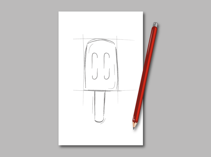
1I always start with sketching. Grab your favourite pen and a piece of paper and roughly outline your motive. It doesn’t matter if you got an image in your head or an original, having your ideas visualised will help you in the next steps to create the right forms on the screen and stick to your initial concept.
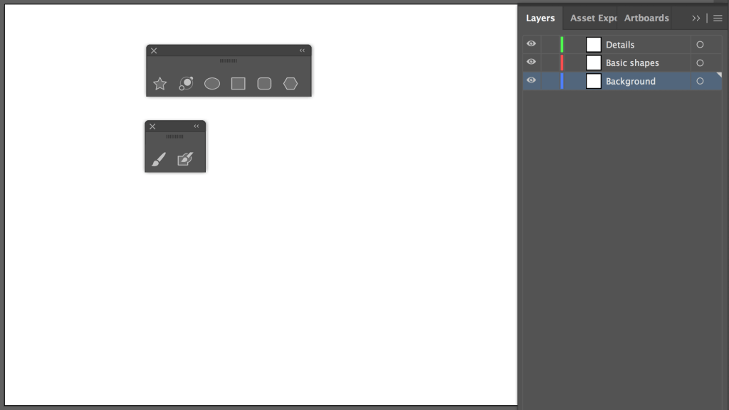
2When it comes to transferring your motive to the screen, you have a lot of different options. You can just scan your sketch, take a picture with your cell phone and airdrop it to your computer or use the Brush Tool to quickly transmit the outlines. I personally prefer to work with a blank screen in Illustrator. I lay my sketch next to the keyboard and and create my illustration by just looking at the sketch. If that doesn’t work for you, just choose your favourite option and go ahead! 🙂 Before you start to work in Illustrator, let me just give to the tip to work with some layers from the outset. You should at least have a background layer, one for the basic shapes and a third for the details in order to keep the overview.
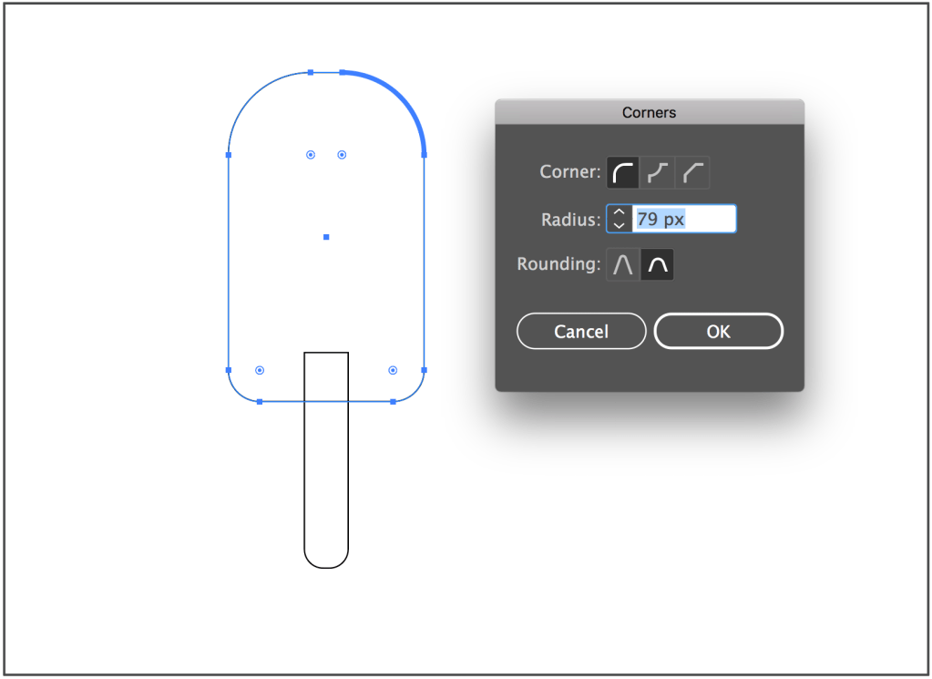
3Having your motive ready you can start your illustration by creating the basic shapes. Therefore I use the Rectangle-, Rounded Rectangle-, and Ellipse Tool. You also always got the option to round each corner of an Rectangle individually by choosing it with the Direct Selection Tool and giving each corner a particular radius. If you got really fancy shapes, you can generate them with the Pen Tool. (Find out more about Illustrator Tools here)
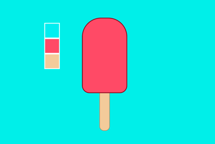
4Let’s start with the fun part and bring your illustration to life by means of different colors. I prefer strong and vibrant colors, but that’s totally down to personal preference. However, I would recommend to use 3-4 colors in order to give your image the simple and ”clean” look. Apart from that, you can make your illustration varied and less flat by playing with the different tonal values and the opacity of the colors. If you’re not really sure which colors suit your piece the most, you can use pages like color hunt that suggest you thousands of different color schemes you can use. Now you’re still needing some outlines, right? Hereby, you also got a lot of different options. I’m fond of contours that have a darker shade of the color you used for your object, because that gives your illustration a very harmonic look. Other popular possibilities are dark gray outlines or classical black ones. In addition, you can vary them in thickness and form.
5When you’re ready you can breathe even more life into your illustration by adding some details. Therefore, I’m using the Pathfinder to create different shapes and the Brush Tool to draw some lines which follow the outlines of my motive to give the viewer an impression of my objects surface. To make the lines look more defined, I change the look of the strokes and increase their width to 2-3pt. Your little refinements will also appear very harmonic when you give them the color of the contours. The secret of this step is: Less is more! We want to add some structure, but we don’t want to lose ourselves in the details. Otherwise the simplicity and the clean look would get lost.

6You’re almost done! The last thing that’s missing are shadows and highlights. This step might sound frightening, but it’s a lot easier than it sounds. As with everything, I’d also be spare with shadings. Just choose the direction your light is coming from and add some object shadings and a drop shadow. I create the object shadows with the Pathfinder and make them slightly brighter than the outline color by changing their opacity. For the drop shadow I’m using the basic shape of my illustration, color it in a darker color shade than my background and layer it behind the drawing. Opposite the shadings you can place your highlight. You can easily create them with the Pen Tool. When you’re not a friend of 100% white, you can also change the opacity to a value around 50%.

It’s a wrap! I hope that I could help you with this instruction and motivate you to experiment a little and become creative. As you can see, doing illustrations is not that hard and when you’ve learned the basics you can develop your own style.
Inspiration for the illustration: @jackrdesign (instagram)

Leave a comment